

Devil's Den is a campground in Williston, Florida, known for its prehistoric underwater spring. Devil’s Den has commissioned the redesign of five essential pages on their current website. The primary goal is to enhance the user experience by refining navigation and visual aesthetics. The redesign aims to elevate the site’s overall look and feel to better reflect the brand identity and effectively engage users.
UX/UI Designer
UX Researcher
Figma
Adobe Illustrator


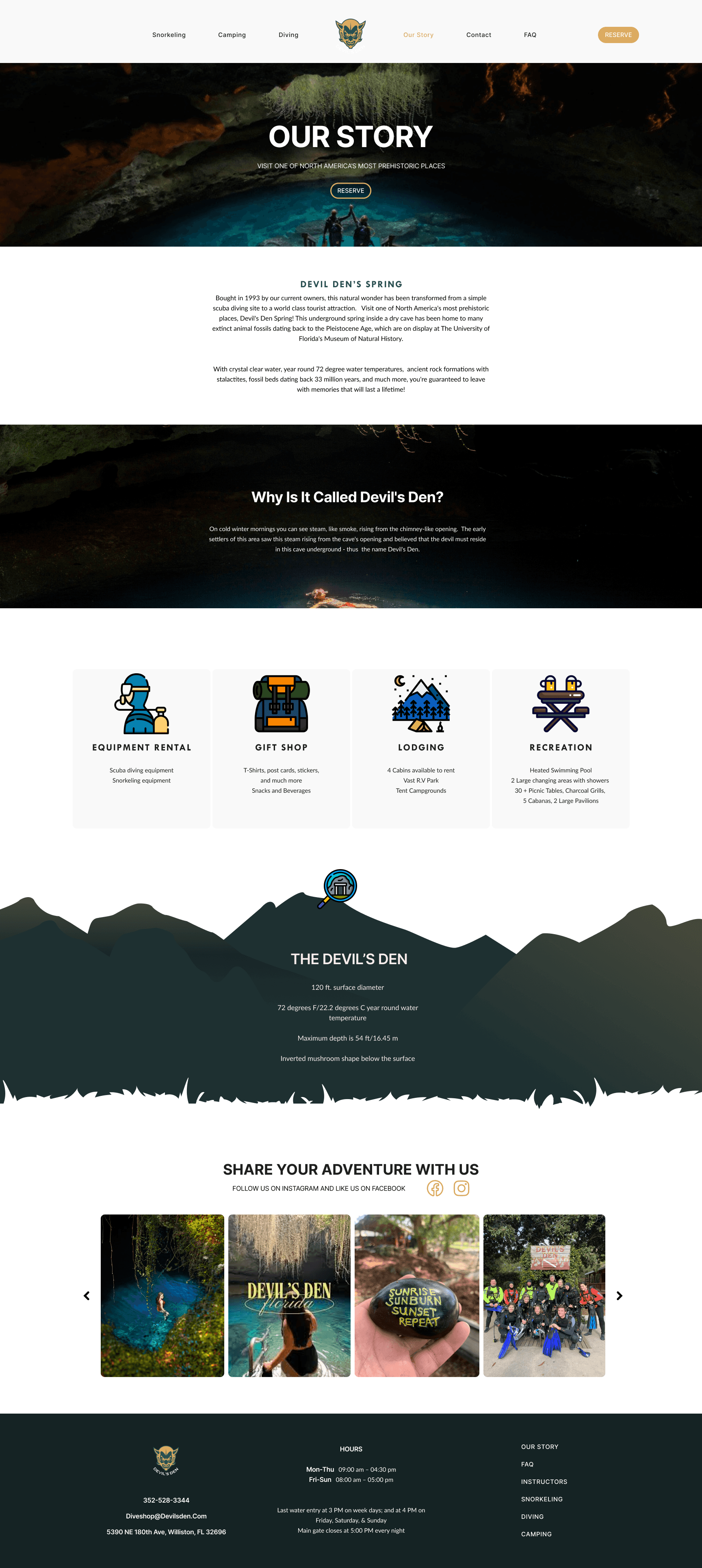
Devil’s Den is a unique natural spring located within an underground cave in Florida. Since opening to the public in 1993, it has evolved from a modest scuba diving site into a world-class tourist destination. The site is celebrated not only for its breathtaking geological formations but also for its rich prehistoric significance.

Enhance
User Experience

Increase
User Engagement

Elevate
Branding
Devil’s Den primarily targets certified divers, experienced snorkelers, and adventurous adults aged 18–45 who are strong swimmers seeking unique underwater experiences, as well as campers, families, and individuals looking to enjoy cabin rentals and nature-based getaways.

1. Enhance User Experience:
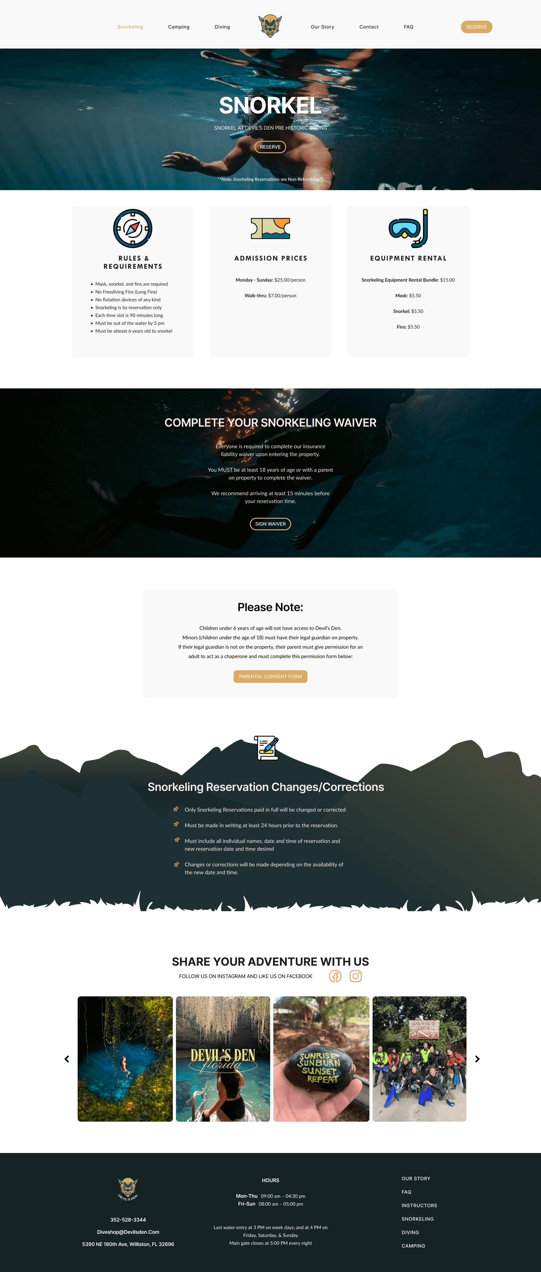
Established a clear content hierarchy using consistent typography styles and layout design.
Integrated custom icons to clearly identify sections such as renting packages, visitor information, FAQs, and reservations
2. Increase User Engagement
Added call-to-action buttons in each section (“Reserve” “More Info” “Sign Waiver”) to drive conversions.
Implemented a user-generated content section or visitor gallery to build community and social proof.
3. Elevate Branding
Created a website logo that resonates with the name "Devil’s Den."
Developed a refreshed color palette inspired by natural elements.
Based on research and analysis of the existing site, we identified the website’s key content and structure. This sitemap supports an intuitive layout, enhances user flow, and provides quick access to essential information.

Here’s the low-fidelity wireframe I developed in Figma to visualize the website’s structure, layout, and user flow before moving on to the high-fidelity design.
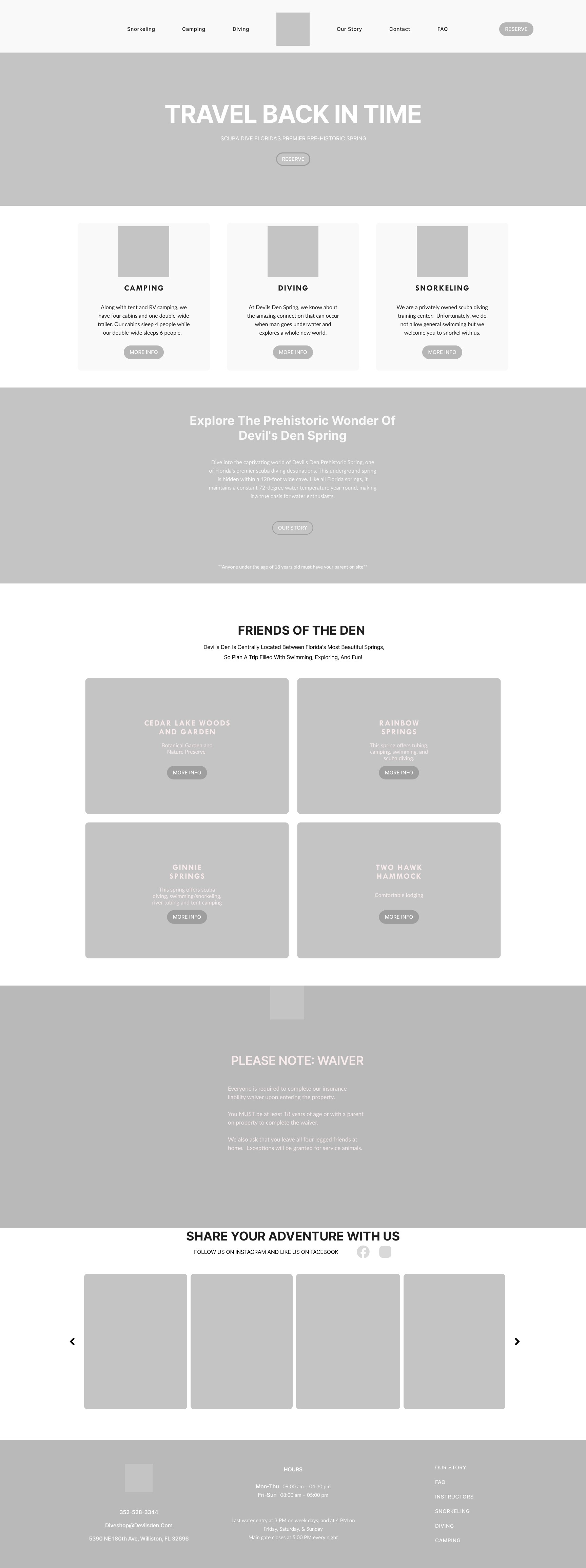


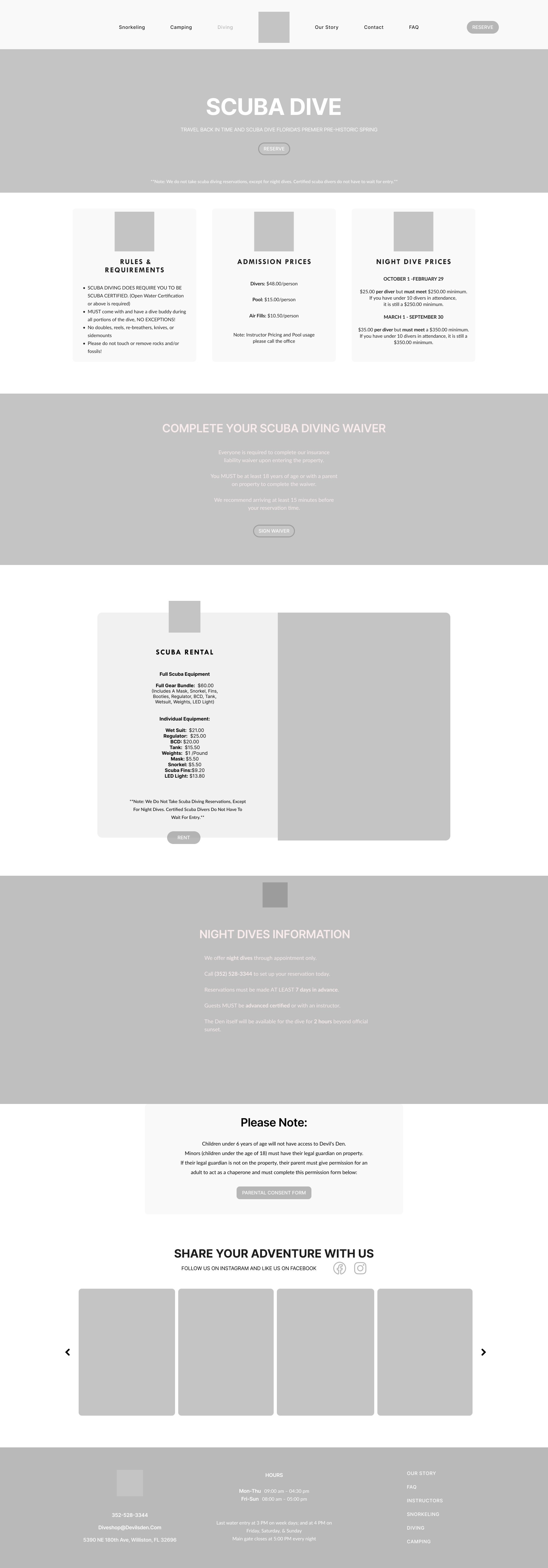
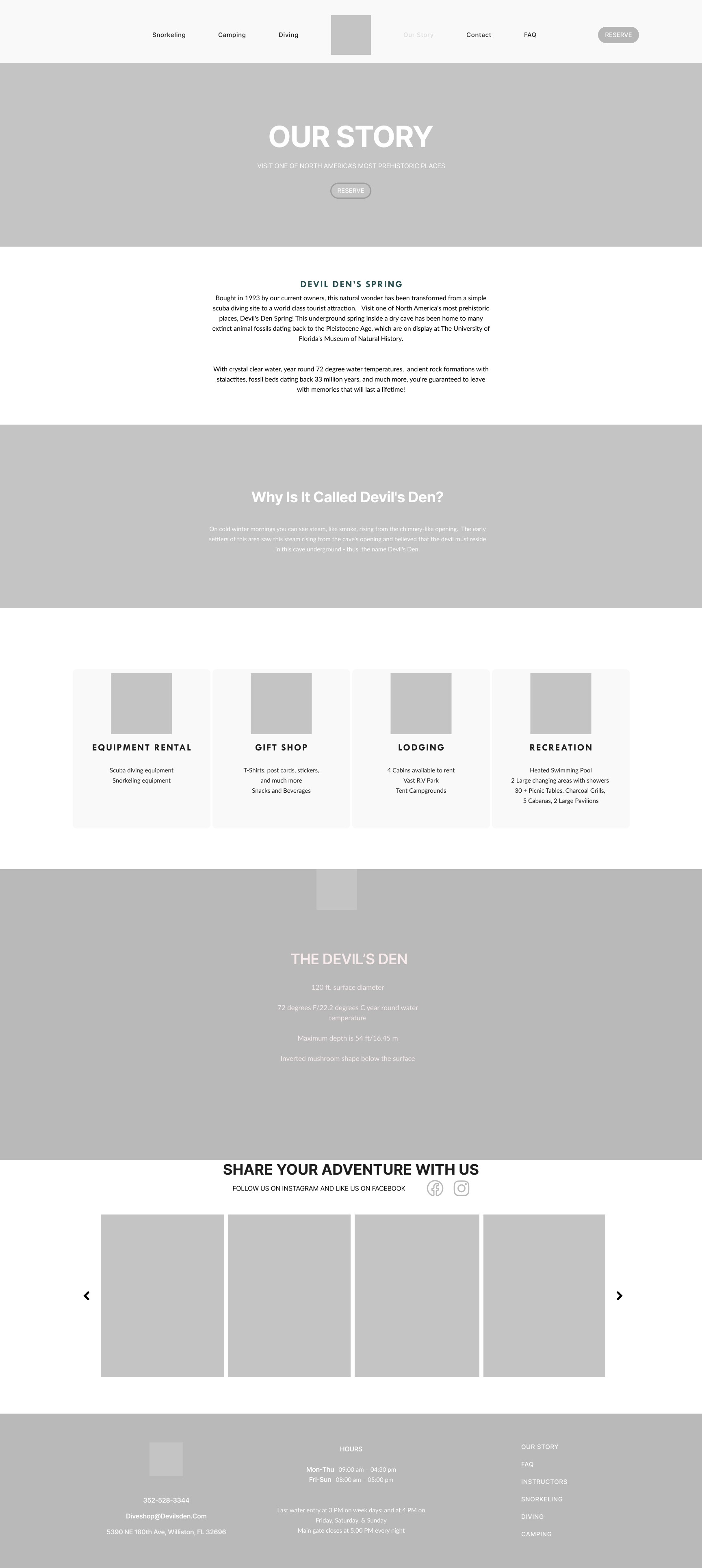
The final design features high-quality photography, an earthy color palette inspired by the natural beauty of the campground, and clean, minimalistic typography to enhance readability and create a calm, immersive user experience.


Establishing a design system that offers consistency without limiting creativity.
Organizing the content into clear, logical sections and determining the most intuitive placement for each within the overall layout.
Overcame challenges in organizing and prioritizing content for clarity and ease of navigation.
Learned how to balance visual aesthetics with functionality and user flow.
Designed with the user in mind—matching content flow to real user behaviors and goals.