
Lumière Theater offers a cozy, upscale cinema experience complemented by a full-service menu. The goal of this project is to design and develop a website that effectively showcases the theater’s distinctive ambiance—defined by comfort and class. The new website will serve as a digital extension of the Lumière experience, enhancing its online presence, attracting new patrons, and supporting overall sales performance.
UX/UI Designer
UX Researcher
Developer
Figma
HTML/CSS
Visual SC
Lumière’s primary audience consists of young professionals, couples, and social groups who value immersive, comfortable entertainment paired with elevated dining. These moviegoers are drawn to experiences that feel exclusive and thoughtfully curated. They expect a seamless and refined digital browsing experience that mirrors the theater’s upscale brand and enhances their decision-making process—from exploring showtimes to reserving premium seats.


Create a Visually Elegant
and User-Friendly Interface

Implement Streamlined
Navigation for Key Features

Establish a Modern,
Refined Brand Presence Online
Design a layout and user experience that visually communicates comfort and sophistication, ensuring every interaction feels smooth, intuitive, and upscale.
Showcase premium amenities through photography, icons, and concise copy to showcase Lumière Theater’s upscale features.
Prioritize seamless access to essential functions—such as ticket booking, viewing menus, and event schedules—through clear navigation and thoughtfully placed calls to action.
Reflect a modern, refined tone that aligns with the audience’s education and income level
We consolidated our research into detailed user personas, which gave us valuable insight into the different types of people seeking an upscale theater experience. Using these personas, we developed an information architecture for the site to ensure the content and structure align with our users’ needs. This process helped us identify key content areas and features based on the user research.

Desktop Wireframe Initial Sketches
We began with rough sketches—mapping out ideas, structure, and flow inspired by what our users truly value.

Here’s the low-fidelity wireframe I developed in Figma to bring our initial sketches to life and begin translating user needs into a clear, functional layout.


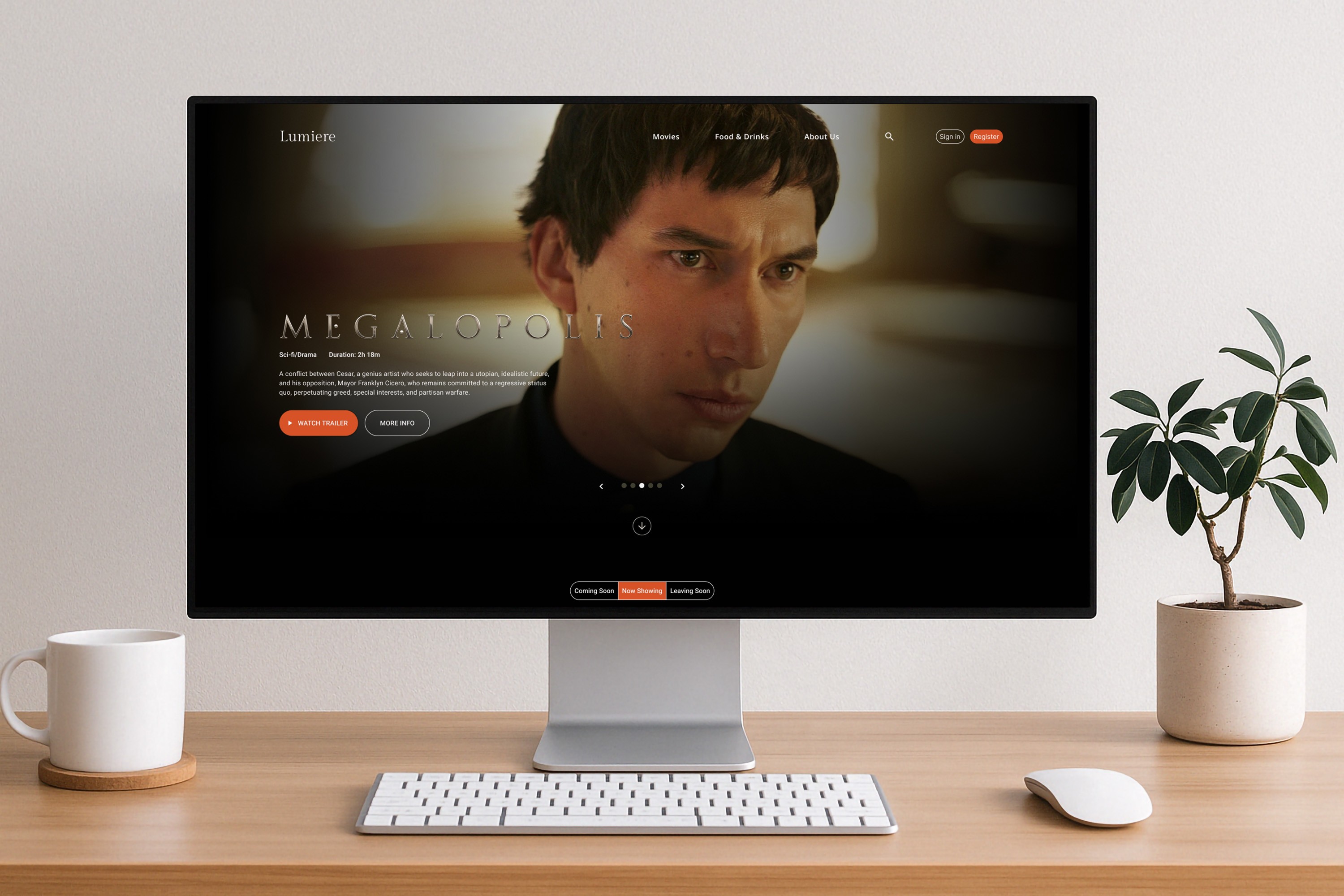
The final design brings Lumière’s vision to life—merging elegance with usability. From refined visuals to streamlined navigation, every element was crafted to meet user goals and reflect the theater’s upscale identity. The site was then developed using HTML and CSS, ensuring both form and function work seamlessly together.


One of the biggest challenges was capturing the theater’s upscale, cozy ambiance through a digital format without overwhelming the user.
Ensuring that the refined design held up across different screen sizes and browsers required extra testing and attention to responsive design principles.
Gaining a clear understanding of the target users shaped the foundation of the site and helped create the refined digital presence I aimed for.
When designing a modern interface, keeping things clean and intentional is key to achieving clarity and a smooth user flow.
Every piece of content was crafted to be relevant, useful, and aligned with what users are actually looking for.