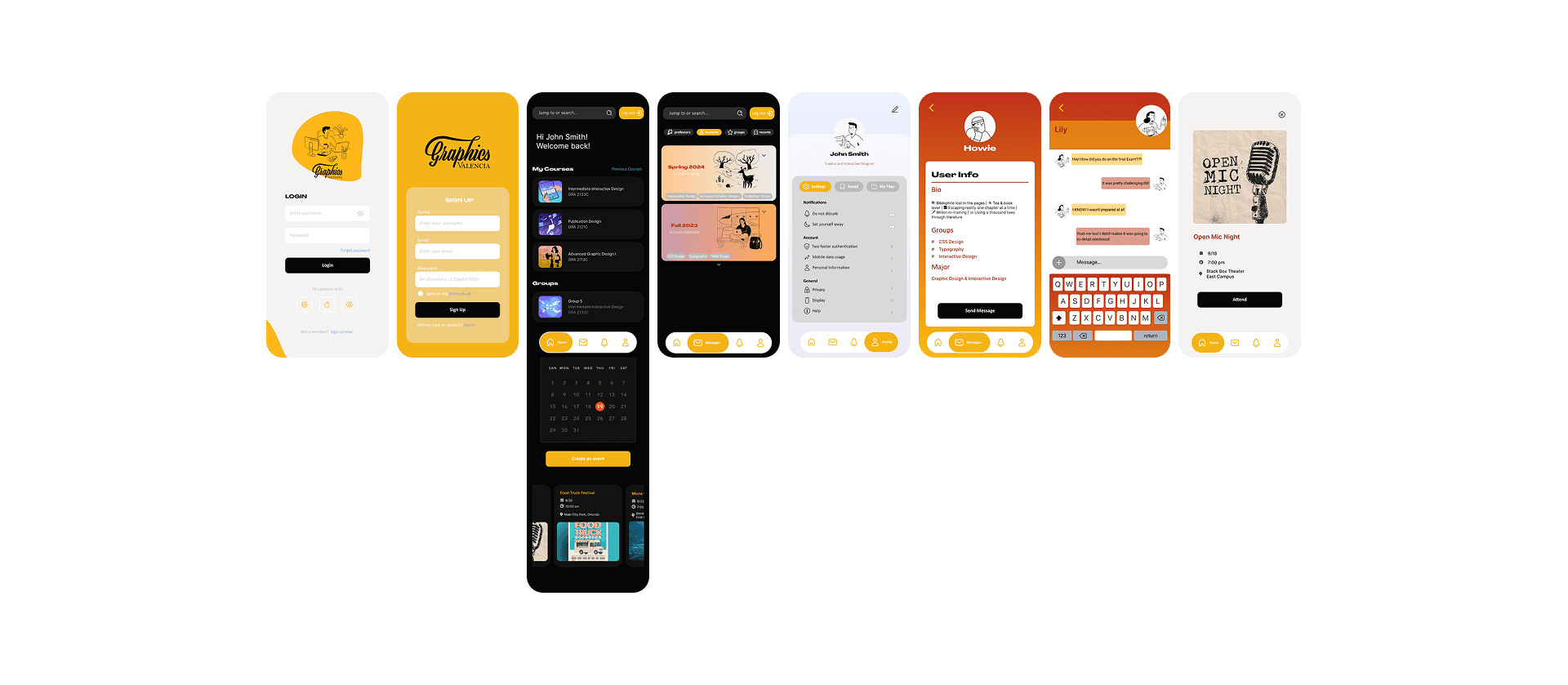
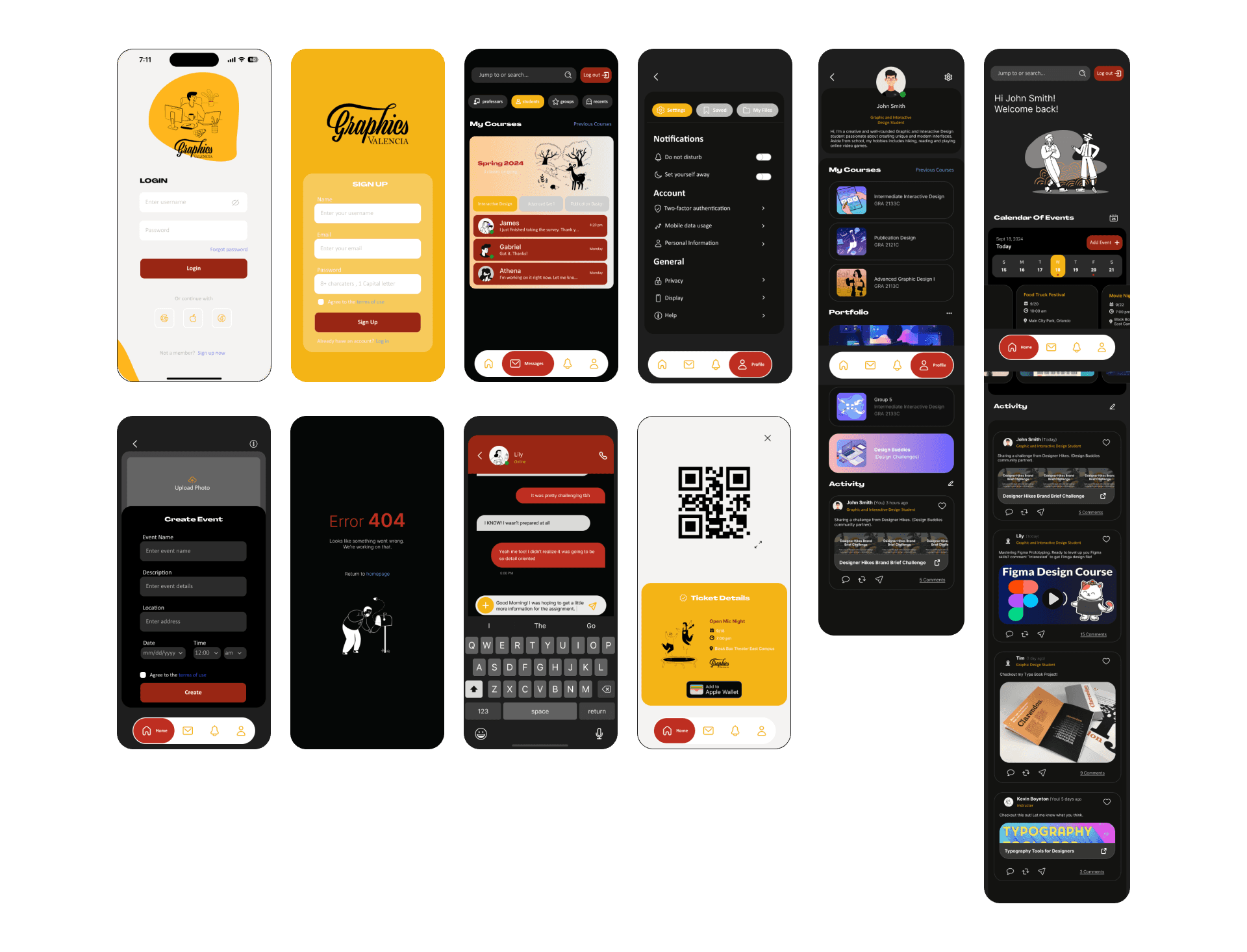
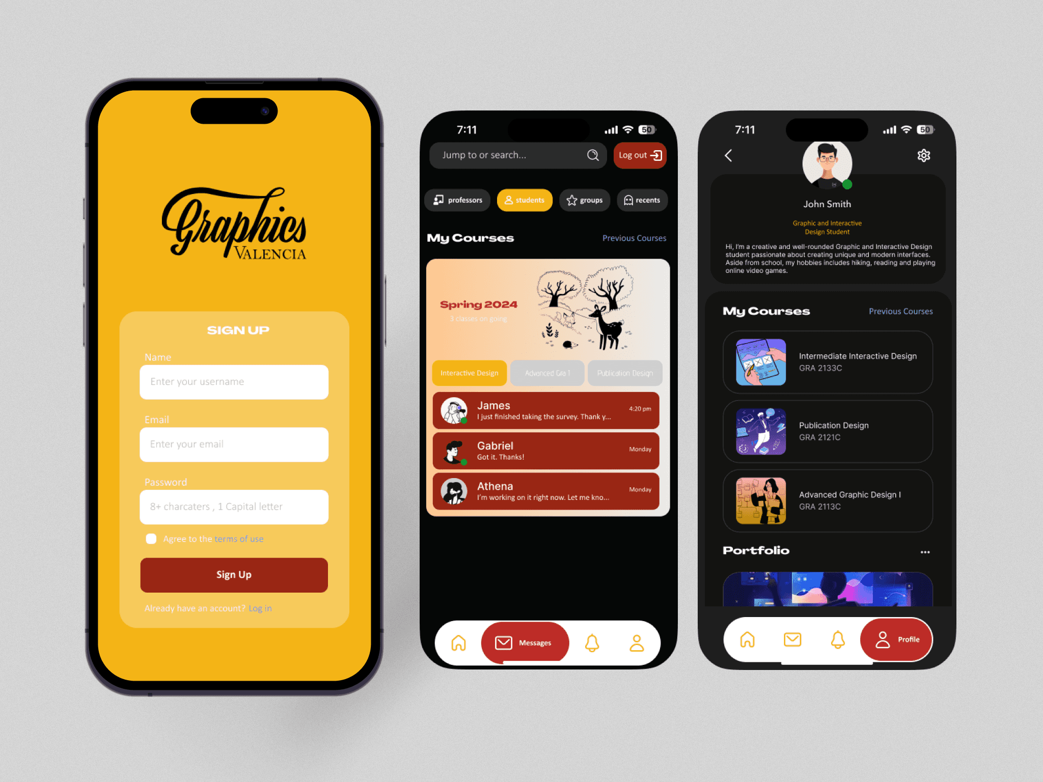
As part of a collaborative project, my classmate and I designed a mobile application for the Valencia College Graphic Design Program. Our goal was to improve communication among students and professors, encourage engagement outside the classroom, and create a more tight-knit community within the program. By integrating essential features into a single platform, we aimed to address existing challenges and enhance the overall experience for users.
UX/UI Designer
UX Researcher
Figma
Adobe Illustrator
What combination of services, available as an app, will increase student engagement outside of the classroom?
For this project we had to generate questions to conduct interviews and create surveys to send out to users. One for students; one for professors. This form of research let us see who are target audience are and what they were used to using, what features of communication apps they liked, and any pain points with what they were using already. Students shared frustrations about missing event notifications because information was spread across different apps. Professors emphasized how student participation often leads to greater success. Our research revealed that users wanted timely notifications, more ways to interact, and a centralized place for important information. These findings shaped our design to ensure the app addressed the specific needs of its users.
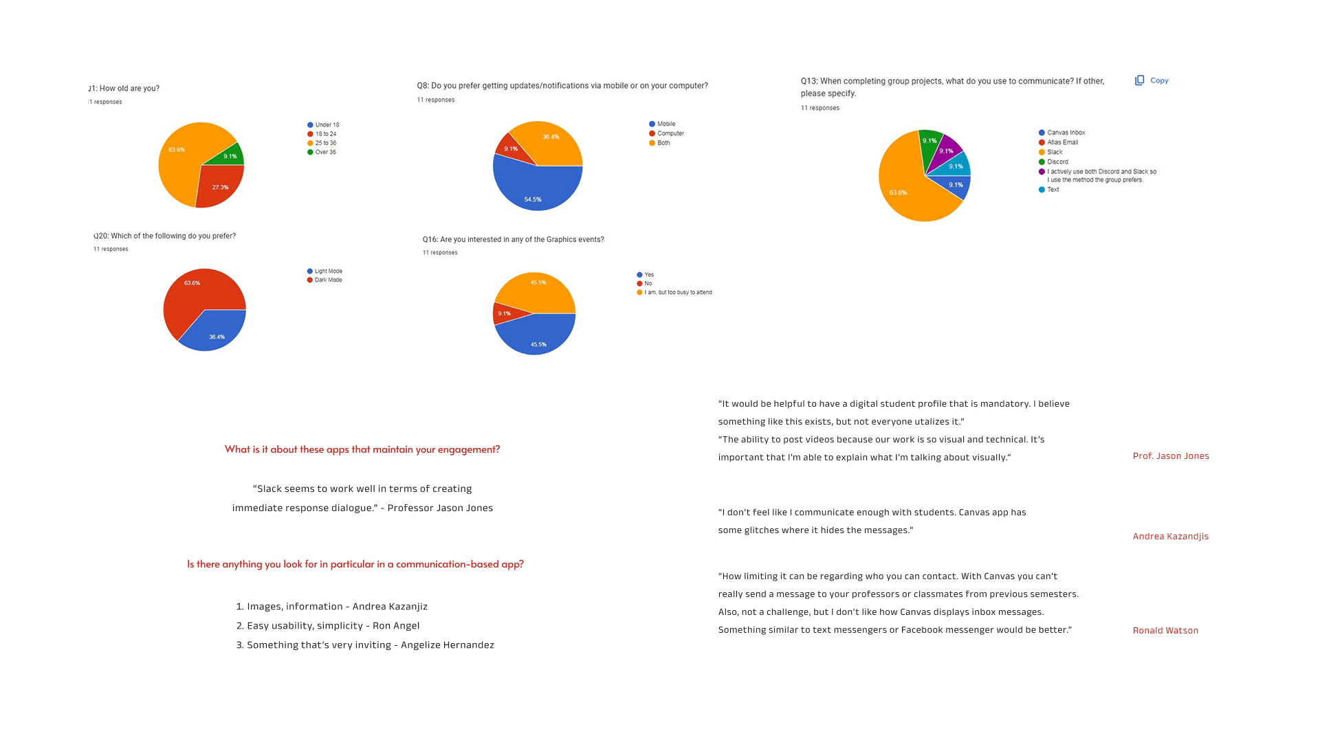
The primary users of the app are students and professors within the Valencia College Graphic Design Program. Students seek an easy-to-use tool for communication, resource access, and collaboration. Professors desire a reliable platform to share announcements and engage with students more effectively. Both groups expressed a need for timely notifications, opportunities for interaction, and access to valuable content like project showcases and professional tips.
Understanding the path a user takes through a product or interface to complete a specific task.


Understanding the path a user takes through a product or interface to complete a specific task.
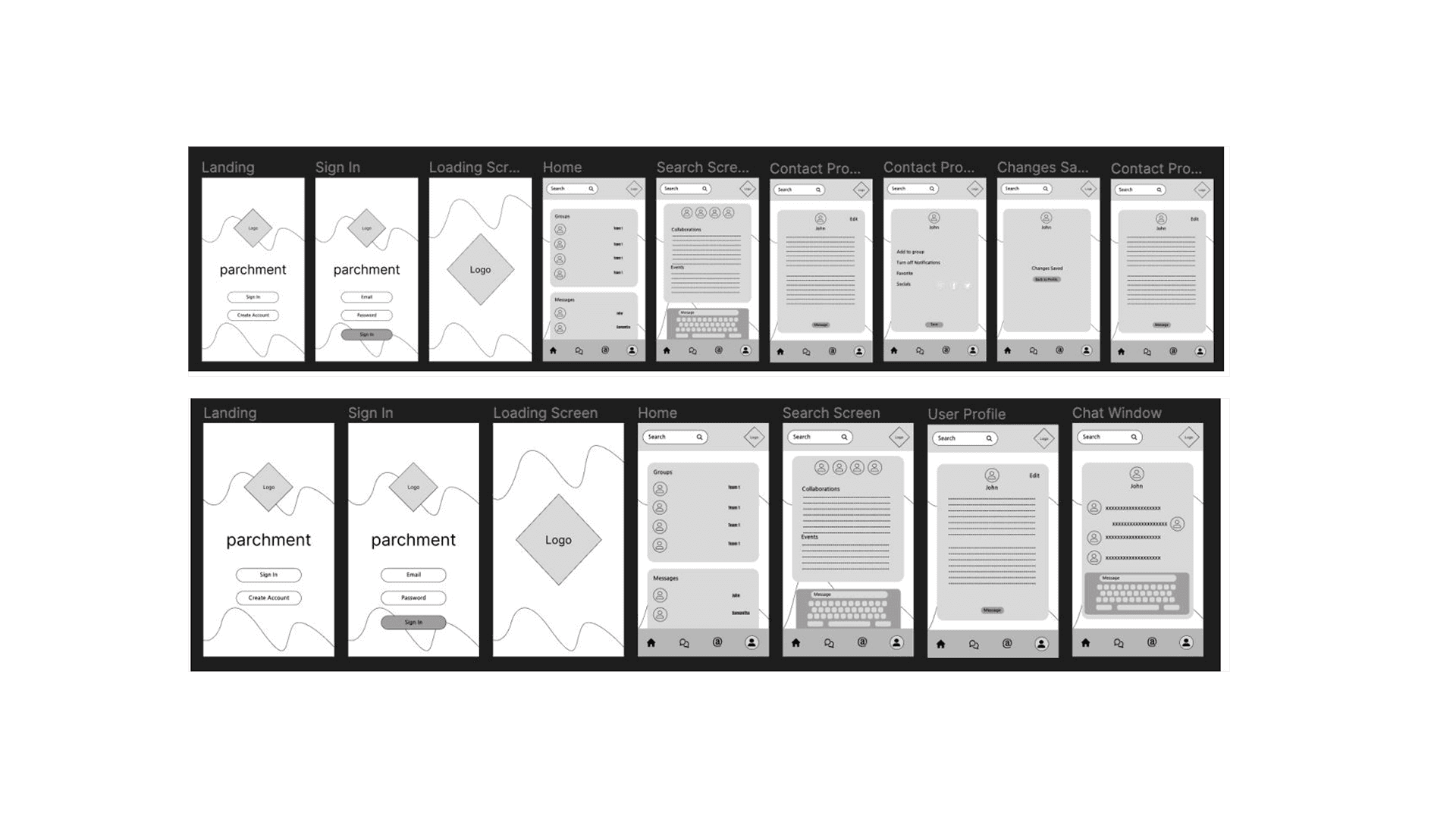
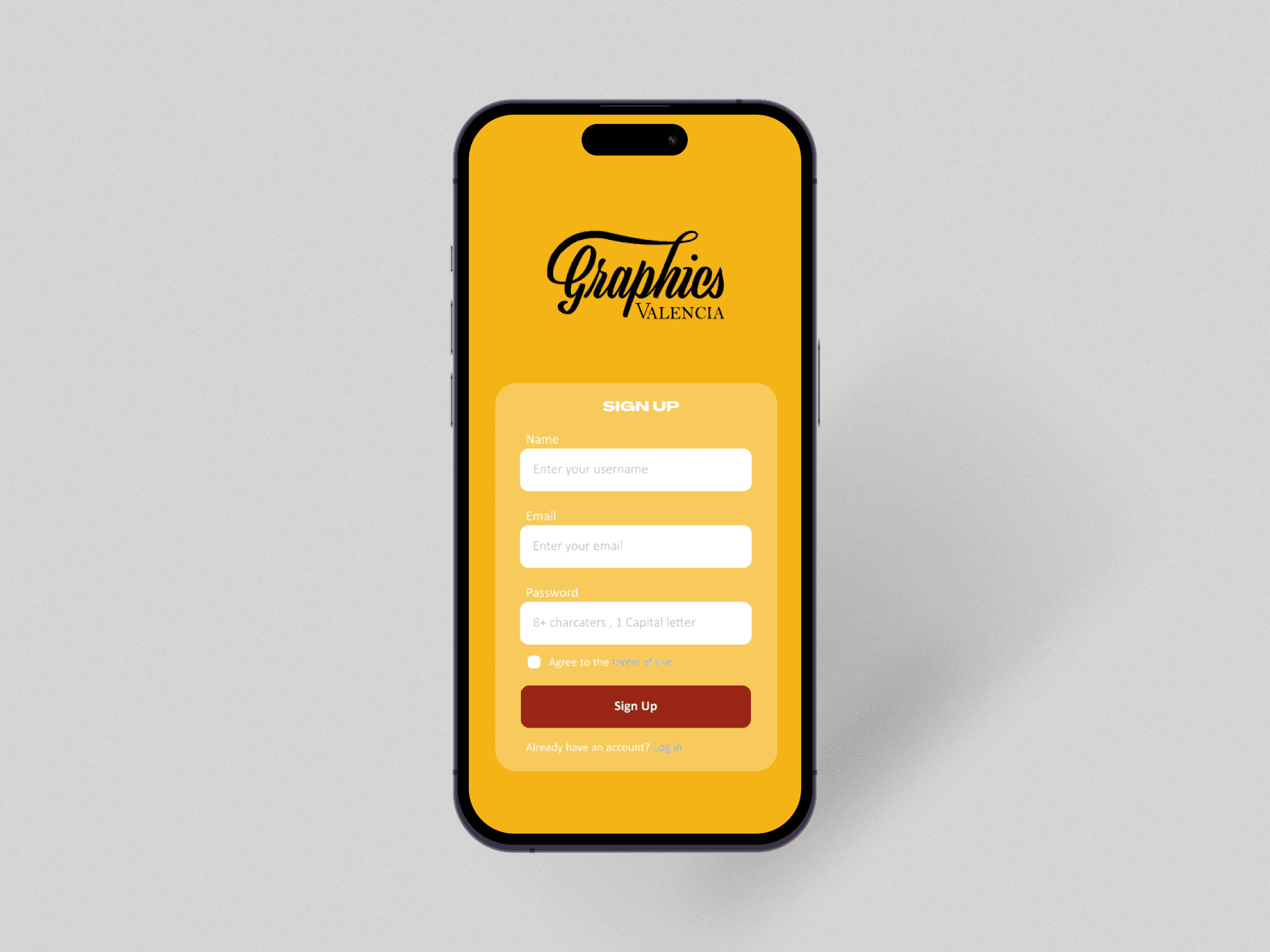
We started our design by creating the login and sign-up screens to establish the app’s visual identity. Key design choices included adding an interactive calendar, enhancing communication tools with a chat feature, and creating a central hub for resources. Most importantly, we implemented bottom navigation to make it easy to navigate throughout the app.
Evaluating Usability with Students
You need to get some information from a student from your Advance Graphics Design class because you missed a day of class. You go to your messages and send a message to Lily in hopes to get the missing information.
You are getting a lot of notifications and would prefer to not be bothered. Go into your user profile and turn off notifications so you can finish your work without being bothered.
You are interested in going to a school event. You see that there’s an open mic night. You want to go so you decide to a get a ticket for the event.
You need to get some information from a prefessor from a previous course. You go to your messages and send a message to your old professor Kevin Boynton.

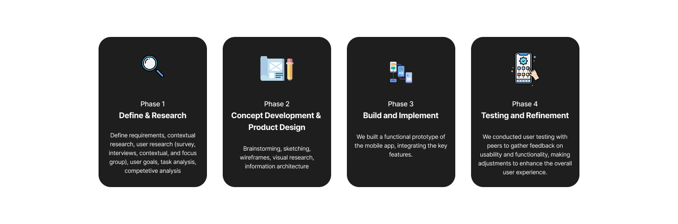
In our final sprint, we reflected on everything we learned, made changes based on user feedback, and finalized the loose ends.
We had to complete it within a limited time frame, which was the academic term.
We couldn't do extensive user testing beyond our classmates.
Overcoming challenges with team collaboration and work style differences.
Testing with actual students and professors uncovered usability problems we didn’t anticipate during design.
Professors and students had different expectations, reminding us to design with multiple user perspectives in mind.
It was my first time completing a project at this scale and impact so I was really proud of myself.